
Guides
How to Read Your BankFlow Dashboard
A walkthrough of the Overview dashboard: what the KPI cards, cumulative trend chart, category spend list, and merchant heatmap actually tell you.
Last verified in BankFlow on August 20, 2026.
Last verified in BankFlow on August 20, 2026.
What This Page Is For
The Overview dashboard, the first screen you land on, is a summary of spending and income across every account you've imported. By the end of this guide you'll know what each number and chart on it actually means and where it comes from.
The Three Headline Numbers
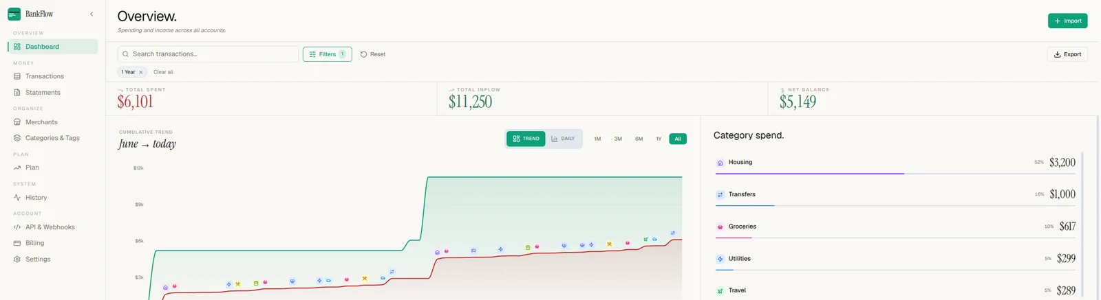
Total spent and Total inflow are the sum of debits and credits across whatever date range and filters are currently active, shown as chips under the search bar (in this example, a "1 Year" filter). Net balance is inflow minus spent for that same window, not your actual bank balance. Change the filters and all three numbers recalculate immediately.
The Cumulative Trend Chart
The chart plots inflow (green) against spending (red) as running totals over the selected range, toggled with the Trend/Daily switch and the 1M/3M/6M/1Y/All range buttons. Each small icon along the spend line marks a transaction, colored by category, so you can see at a glance what drove a jump without leaving the chart.
Category Spend
To the right of the chart, categories are ranked by share of total spend, largest first, each with its percentage and dollar total. This is the fastest way to answer "where did the money actually go" without opening the full Categories & Tags page.
Merchant Heatmap
Below the chart, the heatmap sizes each tile by net flow and groups it by category, with a summary line telling you how concentrated your spend is, for example "Top 7 merchants drive 93% of spend." Switch between Category and Merchant grouping, or use View all to see the full list.

Filters Shape Everything on This Page
Every number described above, the KPIs, the chart, category spend, and the heatmap, responds to the same search bar and filter chips at the top. There's no separate "dashboard filter" and "transaction filter": narrowing the date range or excluding a category here changes what the whole page summarizes.
Next Step
Once you've found the numbers you care about, export the transactions behind them as CSV, Excel, or a QuickBooks-ready file.